Color Palettes That Glide Through a Capsule Decor
Today we explore Color Palettes That Transition Seamlessly in a Capsule Decor Scheme, focusing on building an adaptable foundation that lets rooms flow without feeling uniform. You will learn how to select core neutrals, supportive accents, and finishes that harmonize across spaces, so furniture, textiles, and art can rotate gracefully through seasons, gatherings, and evolving taste while keeping your home coherent, expressive, and deeply personal.
Start with a Cohesive Core
The Neutral Backbone
Select three to five connected neutrals that relate by undertone and depth, then deploy them strategically across walls, large upholstery, and window treatments. Think of soft greige, warm taupe, gentle ivory, and charcoal as anchor tones. Their stability helps artwork, pillows, and portable decor feel at home everywhere. This backbone prevents redesign fatigue, encourages confident purchasing, and gives you room to experiment boldly with accents that can migrate as life and seasons change.
Undertone Alignment
Study undertones under daylight and warm evening bulbs to avoid quiet clashes that undermine serenity. Pair beige with a green undertone carefully with woods and metals that share similar warmth, and match cool grays to crisper whites for a fresh look. Use a pure white card and primary color chips to reveal hidden pinks, violets, or greens. When undertones align, transitions feel luxurious, like a well-curated gallery where each piece belongs without repetition or monotony.

Material Harmony
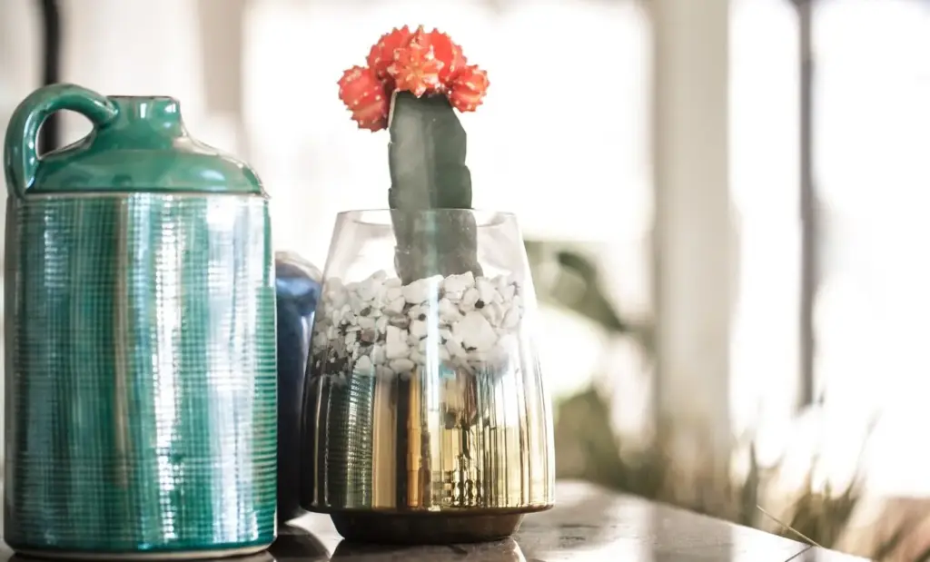
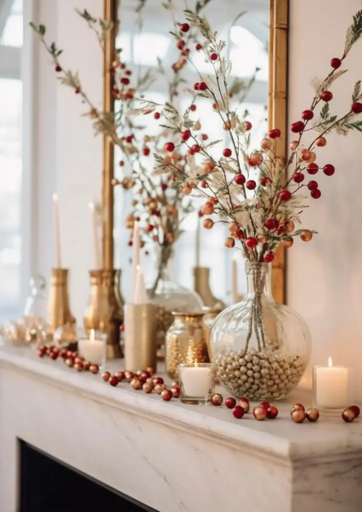
Materials carry color just as strongly as paint. Oak, walnut, brass, chrome, linen, bouclé, and stone each reflect and absorb light differently, shifting how your palette reads between rooms. Echo a finish at least twice for continuity, and contrast matte walls with satin woods to keep spaces dimensional. When materials harmonize across thresholds, your colors follow gracefully, making a studio feel layered, an open plan connected, and a hallway more than merely transitional, but warmly inviting.
Accents That Travel Room to Room
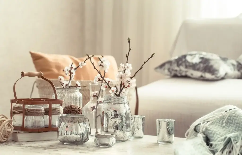
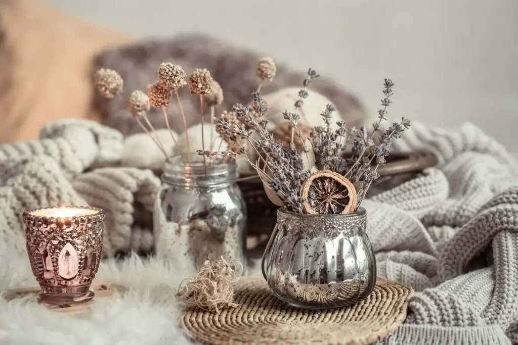
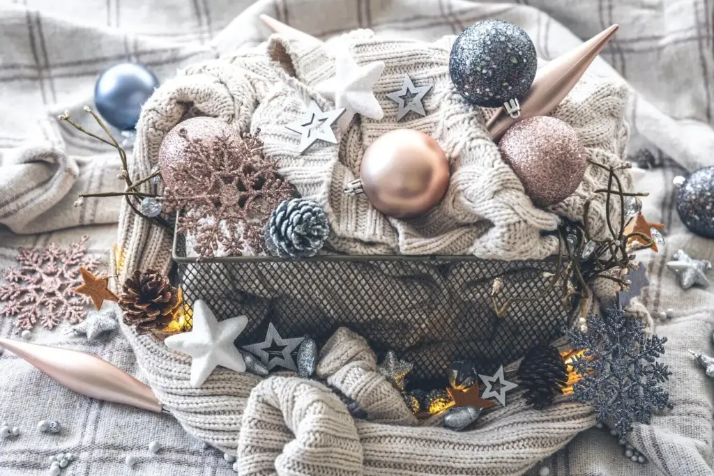
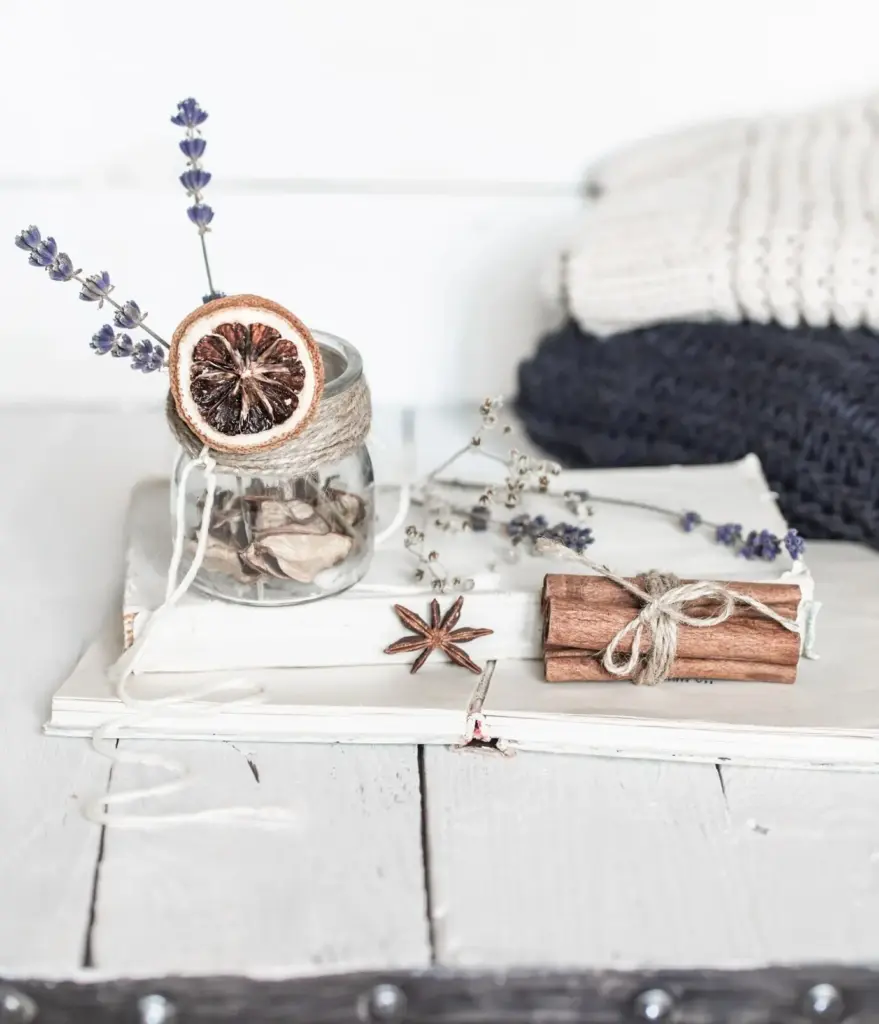
Portable accents are the capsule’s secret power, offering efficient refreshes without chaos. Build a suite of hues that can repeat in cushions, vases, throws, art, and small rugs, then vary saturation or pattern scale to shift mood. A shared accent story links breakfast nook to living room, elevates rental spaces, and keeps styling affordable. Repetition becomes rhythm, not boredom, when you redistribute eye-catching pieces to rebalance energy wherever gatherings happen or quiet reading corners demand subtle emphasis.
Reading Daylight
Walk your rooms hourly with swatches to see how east-facing morning light or west-facing evening glow alters undertones. Photograph samples near windows and in interior corners to capture variance. Note how greenery outside casts gentle green reflections, subtly cooling beiges. Record where sun lingers, then place your deeper accents along those paths for vibrancy without overwhelm. This simple routine turns guesswork into knowledge, giving your capsule choices confidence, clarity, and a living relationship with your home’s rhythms.
Bulb Temperature and Sheen
Artificial lighting can sabotage or elevate beautiful palettes. Aim for consistent Kelvin temperatures in adjacent rooms, and use dimmers to modulate mood without swapping colors. Pair eggshell walls with satin trim for tactile contrast that reads expensive, and reserve high gloss for selective architectural highlights. Matching bulb temperature to your undertones keeps transitions believable after sunset, ensuring your carefully tuned capsule looks as elegant at midnight as it does in bright afternoon gatherings or quiet weekend mornings.
Stories from Real Homes
Practical magic shows up in everyday spaces. We’ve seen tiny studios grow larger by repeating soft mushroom and muted ink, then letting amber glass migrate seasonally. Families maintain harmony by anchoring with oatmeal walls and letting teal accents tour rooms. Renters thrive with peel-and-stick color, art ledges, and layered textiles. These anecdotes prove that restrained palettes expand possibilities, not limit them, encouraging experimentation, mindful collecting, and confident moves that protect budgets while celebrating identity and evolving lifestyles.

Testing, Tools, and Confident Decisions
Great transitions start with honest testing. Build portable sample boards, track observations across times of day, and compare finishes under identical bulbs. Use digital mockups to sketch ideas, then validate with real swatches. Photograph rooms from consistent angles to see continuity develop objectively. Invite feedback from friends or our community, and share your notes. Documentation reduces impulse changes, protects budgets, and builds a personal reference library that supports growth, resilience, and playful experimentation without unnecessary repainting or regret.

Longevity, Care, and Seasonal Evolution
Regularly dust surfaces, rotate textiles away from direct sun, and clean walls with recommended methods based on sheen. Touch-up kits labeled by color and room speed fixes before tiny scuffs become distracting. Protect rugs with pads to stabilize saturation appearances and avoid skewing undertones through uneven wear. These small rituals maintain the palette’s credibility over years, helping transitions remain as smooth as the day you began, while saving time, money, and creative energy for joyful seasonal adjustments.
When you crave change, start with movable layers: slipcovers, pillow shams, lampshades, and art mats. Shift the bold accent into a new focal area, introduce a deeper tone of an existing color, or swap in richer textures like velvet for winter. Because the core remains steady, each tweak reads intentional. Share before-and-after moments, gather feedback, and inspire others to try graceful rotations. You will feel renewed energy without upheaval, respecting the capsule’s clarity and your calendar’s real constraints.
Source secondhand frames, remnant fabrics, and vintage ceramics within your chosen palette, giving character without waste. Buy fewer, better accents that can relocate effortlessly, and document what truly earns its place. When parting with items, donate within community groups to extend each color story’s life. Sustainability aligns naturally with a capsule approach, reducing churn and celebrating considered decisions. Invite readers to share local resources, favorite repair tips, and swap opportunities that keep homes vibrant while honoring the planet.

All Rights Reserved.